Public Art? Rocks, Keys, Dog & Bone?
Controversial public art raised its ugly head again in Calgary recently with the commencement of the construction of the Bowfort Tower artwork on the off ramp of the TransCanada Highway and Bowfort Road NW. Yes, it is a strange place for public art. Yes, it is a strange name for a public artwork - sounds more like a new downtown condo or office tower.
And yes, it seems like a strange choice as the NW gateway to Calgary.
Bowfort Towers public artwork on the Trans Canada Highway at Bowfort Road.
Change of heart?
When I first checked the City of Calgary's website to see what information they had posted about the piece, it included a statement about how the artwork referenced Calgary's Indigenous culture however that statement has been removed. Link: City of Calgary, Bowfort Towers
Also since all of the controversy Mayor Nenshi and Chiefs of Treaty 7 have issued a joint statement saying that the piece was never intended to reference Calgary Indigenous Culture. Link: Nenshi Treaty 7 Chief's Joint Statement
However, on August 3, 2017, CBC posted the following statement as part of their coverage of the newly installed public art:
The Bowfort Towers on the south side of the interchange were designed by artist Del Geist, who is based in New York, N.Y. Sarah Iley (Manager Arts & Culture, city of Calgary) said Geist drew inspiration from the Blackfoot people, and the towers capture the "essence, personality and history" of the area. "Those four towers relate to the Blackfoot cultural symbolism that talks about the four elements, the four stages of life (and) the four seasons," Iley said.
Link: CBC: Gateway to the City: Art Installation
Sorry I don't think you can just now say the piece doesn't make reference to the Blackfoot culture after saying it was.
Blackfoot burial platform
Calgary we have a problem
As a former public art gallery curator and frequent public art juror, I have often wondered why modern public art seems to be skewed towards the conceptual and minimalist genres, rather than just being fun. I think this is especially true for what I call “drive-by public art,” i.e. public art that the public can’t get close, or have a chance to take some time to examine it, reflect and ponder its meaning, its concepts, which is critical to understanding and appreciating conceptual art.
When I saw the Bowfort Tower, I immediately knew we were in for another round of public art outrage. I passed by it almost everyday for a week waiting to see how it was going to look, but it just stayed the same – eight iron or wood pillars (hard to tell the difference when driving by) with flat rocks floating in the pillars. It looked unfinished. It looked like part of the construction site. And yes, is did remind me of indigenous burial sites.
Perhaps, before any public artwork is installed, it should be vetted by a larger public than just a jury and administration. Perhaps, City Council should have final approval of all public art works just like they do all secondary suites. Just kidding!
Obviously, the current open invitation, which is short-listed by administration, with the final decision being made by a different jury of art professionals, community representatives and administration for each piece is isn’t working. In fact, many experienced artists won’t submit to juried competitions because they know the process is flawed. Sad, but true!
However, not all is lost when it comes to public art in Calgary…or is it? Depends on who you are talking to. Read on...
Close-up view of UNLOCKED a new temporary public artwork on 17th Avenue SW.
UNLOCKED
While Bowfort Towers was getting all the attention by public art zealots, over the past two weeks, few were commenting on Calgary’s other two new public artworks – Boney, located in SETON at the entrance to the new Medical Professional Building and UNLOCK, in the middle of the sidewalk on the 200E block of 17th Ave SE.
UNLOCK, while also visually fun, is a more thought provoking piece. It consists of a wire mesh archway (12 feet long, 6 feet wide and 8 feet high) located on the sidewalk on 17th Ave SE, between Centre Street and 1 Street SE in front of a new apartment block. Artist Joanne MacDonald sees keys as a signifier of personal memories – first bike lock, first car keys, first keys to your apartment. In a letter to local businesses along 17th Ave SE, she asked them to donate keys to be installed on the archway. It is also her intention to encourage the public to participate at upcoming community events by donating keys as well.
In her letter to businesses along the block, she hoped UNLOCKED would “promote discussion on themes like accessibility, opportunity, privilege, employment, ownership and gentrification.” I think this is a big leap to think the keys will be the catalyst to promote discussion, however the archway does create a fun pedestrian experience whether you walk through or around it.
We visited at twilight and the setting sun sparkled off the metal keys created a lovely ambience while we lingered for a few minutes before moving on.
Unlock could become a very interesting installation in the right location.
Personally, I like the way the artist’s references the wire mesh fences that are used at construction sites everywhere in her arch. I think it is great when public art can connect with its site in some manner. I like the simplicity of the structure and to me, the archway visually creates a pageantry-like experience that enhances the everyday sidewalk experience.
What I didn’t see in the artist’s statement or city explanation is the that artwork is an interesting spin on the world wide phenomena of lovers (often as tourists) placing locks in public places as a declaration of their love for each other. When I first read about the piece, I assumed the artist and the City were encouraging couples and families to come to the archway and add their keys to the artwork as a symbol of their love of each other – a modern love-in you might say.
I love interactive public art.
Backstory: Unlocked is one of four public art pieces being installed this August as part of a new program called The cREactive Realm developed by Blank Page Studio in collaboration with The City of Calgary. It is seen as a way to support businesses along 17th Avenue while streets are torn up to replace water and sanitary lines, repair and rebuild the road and make public realm improvements – new sidewalks, benches, trees and streetlights. The goal is to create interactive, playful experiences using public art that will draw Calgarians to the blocks while they are under construction. The total budget for the four artworks is $50,000.
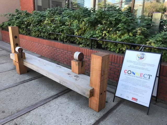
This is another of the four public artworks being produced and temporarily installed along 17th Ave SW during construction as a means of attracting people to visit 17th while it gets new sidewalks and utilities. Budget $15,000.
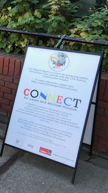
The signage says: CONNECT is a project designed to bring an artist workspace into the Public Realm. Working towards the creation of a piece of public furniture Laura and Micheal Hosaluk are designing and developing their ideas as they share their creative process with you.
Using the lathe and the bandsaw to cut and form Red Cedar from B.C. and Milk Paint to add colour this duo will be working to transform raw materials into a celebration of the process.
BONEY
This bone is perched near the roof-top of the EFW Radiology building in one of Calgary's newest communities - SETON.
Boney is a whimsical 9-foot tall purple dog consisting of nine bone shaped pieces designed by the German arts collective Inges Idee (yes, this is the same collective that brought us Travelling Light, better known as the Giant Blue Ring), fabricated and installed by Calgary’s Heavy Industries, who have been responsible for the fabrication of many of Calgary’s new public artworks. Adding, to add to the whimsy, the dog is looking up to the top of the building where another bone is on the roof.
Trevor Hunnisett, Development Manager of Brookfield Residential says, “the response to date has been excellent. Given the piece’s location across from the South Health Campus and at the front door of our new medical building, we wanted something that would put a smile on a person’s face regardless of age and personal circumstances.” In this case, the piece was chosen and paid for by Brookfield Residential - no jury, no City money and no controversy. Hunnisett wouldn’t divulge the exact price of the artwork but did say it was less than 1% of cost of the building.
Before the snarky public art purists say something like “Sure, all Calgarians want are fluff pieces of horses and other kitschy art,’ I would like to remind them that Jeff Koons has become one of the world’s most famous artists creating artworks that look like the balloon animals pone would see at a child-oriented event. His work is collected by many knowledgeable collectors and is in the collection of art museums around the world.
If I had one criticism of Boney, it is that it is derivative; one could even say plagiarizes Koons’ work. It is the polar opposite of Bowfort Towers in that it has no hidden meaning, concepts or social statements.
It is just plain fun – and what’s wrong with that? In my mind Calgary’s new public art is too skewed to obscure conceptual art; sometimes public art can (should) just be fun!
BONEY looking up at the bone on the roof. I love that BONEY's tail and ears are bone-shaped and the cheerful purple colour. Is it just coincidence that Boney is Nenshi purple????
I also love the simple seating that is all around the piece inviting the public to sit and chat; that's being public friendly.
Another view of BONEY with the South Health Campus in the background.
Last Word
Sometimes I think artists and curators expect too much from public art. While it can be a catalyst for discussion and debate, in most cases, the public glances at the art, likes it or doesn’t like it, and moves on. There is not a lot of thinking, pondering and reflecting on its meaning, concepts, social or political statements.
What it does do in subtle and subliminal ways is make the pedestrian experience more interesting. To me, urban places are often defined by the diversity and quality of their public art, even if we don’t always realize it.
Personally the best NEW piece of public art in Calgary was a grassroots one in the LRT pedestrian underpass from Sunnyside to 10th Street at Riley Park.
This rainbow was painted to celebrate Calgary's Gay Pride Week. I love the fact that someone has taken the time to clean up the area around the underpass. After I took this photo they toss the garbage in a dumpster nearby.
I am thinking that if the Bowfort Road / Trans Canada Highway underpass had been painted like this on a permanent basis, it would have been well received. In addition to adding some colour to a concrete grey underpass, it would also have delivered an uplifting message i.e. Calgary is an inclusive city or perhaps Calgary is a city hope and optimism. Both of which are true and would be very appropriate for a gateway artwork.
If you like this blog, checkout these links:
Confessions of a public art juror


